Mobile Form Design: A Beginners Guide to Converting Mobile Users
Think about a time when you were on the train, sitting in the airport, or simply lying on the couch, and you had to complete an online form on your smartphone. Did you ever pay attention to the mobile form design?
Chances are you haven’t noticed. That’s the goal — to give users an intuitive experience that gets them to seamlessly fill up the form and continue with their day.
In this guide, we’ll review the most effective ways to do just that. Here, you’ll learn how to design mobile forms that are not clunky or misaligned, but that help boost conversions and create a great user experience.
Table of Contents
Mobile vs. Desktop Form Design
Today, your website visitors aren’t just browsing your site, viewing your content, and completing your forms from their desktop computers. They’re also completing these tasks from their mobile devices.
Mobile was responsible for nearly 60% of global website traffic from April to June 2022. That means it’s critical for your form to be simple to review, complete, and submit via a mobile device.
Why is mobile form design important?
The best mobile form design allows for a positive user experience, which ensures a happy website visitor who’s more likely to convert to a customer and become a returning user.
The design, layout, and functionality of your mobile forms play a large part in your website’s overall user experience.
If your forms aren’t mobile-friendly, you may experience fewer conversions, a loss in mobile site traffic, and an increase in unhappy and frustrated customers. And who wants that?
Why should mobile form design differ from desktop design?
“Everything works differently on mobile, so marketers need to make sure any elements of their websites are always optimized for mobile,” says Lilach Bullock, an award-winning marketing influencer and strategist.
“And that, of course, includes forms — especially since it feels like you constantly have to complete forms while on mobile.”
Specifically, think about the difference in the display or screen size between a mobile device, such as an Apple iPhone, which typically ranges from 4.7″ to 6.7″ in size; and a Mac laptop or desktop, which typically ranges from 13” to 24” in size. It’s safe to assume a form that fits an iPhone screen wouldn’t fit a desktop screen perfectly.
If your mobile visitors cannot easily read, complete, and submit your form, you may lose their business. So creating a mobile-friendly form that fits the screen of any mobile device is crucial to creating a great user experience in order to leave a lasting impression on your visitors and help you boost conversions.
What is responsive web design?
If you want to take mobile form design a step further and ensure your entire website is functional on all types of devices, you can implement a responsive website design.
Responsive web design takes into consideration the user’s screen size, platform, orientation, and environment. This is a simple and effective way to create a great user experience since so many people are constantly visiting and browsing different websites on various devices.
There are several ways you can make sure your site has a responsive design. For example, if you’re a WordPress user, there are several responsive WordPress themes that you can install and use to design your site.
Additionally, if you’re building, or have built, your site with software such as Squarespace, your site may automatically come with responsive web design.
Today, responsive web design is a popular choice for businesses due to the sheer number of people visiting websites via a variety of different mobile devices. But for now, let’s get back to discussing mobile form design.
Mobile Form Design: 11 UX Guidelines
“When designing your mobile forms,” explains Bullock, “it’s important to keep things simple and make them as quick as possible. [Forms] are more difficult to complete on mobile and everything feels like it takes longer than it should.”
In other words, the most important thing is simplicity for the end-user. When creating a mobile-friendly form, there are some steps you’ll want to take to provide the best user experience possible for your visitors. Let’s review 11 of these mobile form design best practices that you can begin implementing today.
1. Minimize the number of form fields.
Ever heard the saying, “less is more”? Well, that’s precisely what you should be thinking while creating your mobile form.
Between the size of a mobile device’s screen and the amount of content you need to place in your form, it’s easy to accidentally make your form feel cluttered. Remember to remove unnecessary fluff. Only keep the form fields for information that you absolutely need.
To streamline the process, you’ll also want to label your form fields clearly and succinctly, and mark optional fields as “optional” or include an asterisk next to the required ones.
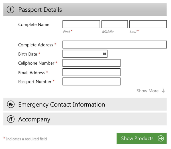
The aim is to make the form as easy as possible to fill out so that the chances of people completing the form go up.
2. Automate inputs when possible.
If you accidentally mistype your street address and the form corrects the spelling for you, the form autocorrects your response.
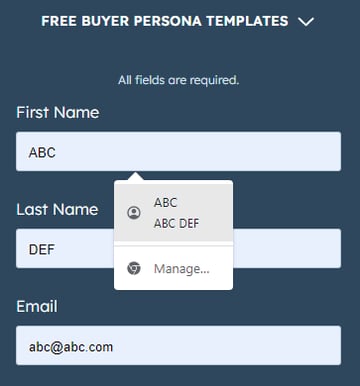
If you begin typing your shipping address and a box pops up with the rest of your address asking you if you want to “autofill” the rest of the form fields with your saved address, then your form is autocompleting your response for you.
By implementing autocorrect and autofill features on your mobile forms, you’ll improve user experience by making it quick, simple, and straightforward for users to enter their details.
In the below example, a person can easily autofill their information by clicking on the small pop-up that appears.
3. Use a single-column layout.
When you’re creating a long or multi-step form, list all of your content in a single-column layout.

Single-column form layouts are:
a. Easier to read.
Placing all your form fields in a single-column format allows your visitors to focus on only one item at a time, making your form easier to read.
b. Less daunting.
If you look at a form, especially in a tight space as you would on a mobile device, and see a large amount of content smushed together, you may feel overwhelmed. That’s why separating your content by rows and placing your form fields in a single-column format make your content look and feel less intimidating.
c. Quicker to complete.
When you place your multi-step form in a single column, leads can complete it more quickly than they would a multi-column form. That’s because the format makes the form easier to read and work through step-by-step.
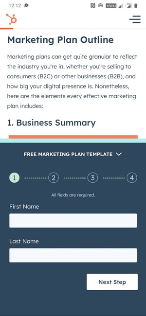
Take a look at this sign-up form on the HubSpot website when viewed from a desktop or a laptop.
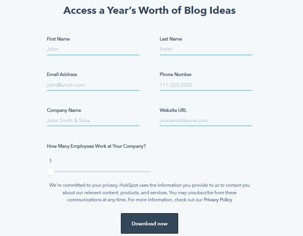
The two-column layout makes sense here, as there’s plenty of space on the wider screen to work with. Now check out the same form when viewed from a mobile device.
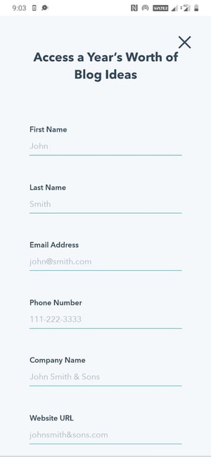
This single-column layout allows the eye to flow naturally while preventing clutter on the compact mobile screen.
4. Consistency matters (and so does form appearance).
How do you close a folder or an open tab on your laptop?
By clicking the ‘x’ button in the top-right corner.
But what if the button didn’t appear while on a particular application? How would you feel when you went to close the window?
Confused or irritated, maybe. You might spend a minute or two figuring out how to shut the application.
This is just a broad example but serves well to illustrate the importance of consistency. Watch this video to learn more.
Consistency in form design applies not just to style (colors, typography, logo, etc.) but to generally-accepted conventions that people are used to.
Here are some tips to ensure a consistent experience:
- Match your form’s look and feel to your brand and website.
- Ensure your form’s styling and formatting are consistent and complementary (nothing should look jarring or out of place).
- Align your form field inputs to the left.
- Affix each label above its corresponding input box and left-align it.
- Use an asterisk to indicate compulsory questions.
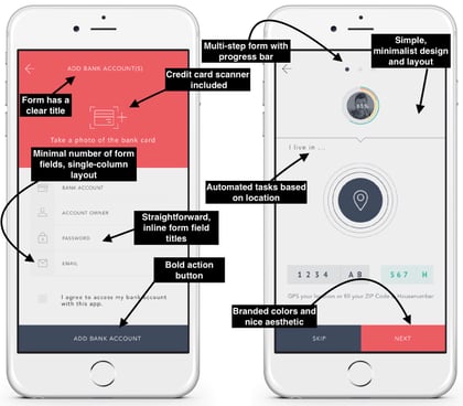
First impressions leave a lasting impression (in life and in business). That goes for your mobile forms. Nobody wants to complete a dark, difficult-to-read, cluttered, and unattractive form.
Your mobile form should be highly functional as well as aesthetically pleasing. Its appearance should contribute to its readability and positive user experience. To achieve this, use a simple and easy-to-read font style and size, a color palette that doesn’t feel overwhelming, and minimal form fields.
5. Keep in mind the touch experience.
Think about how you hold your phone while texting.
Most likely, gripping the phone with two hands while using your thumbs to interact with the screen. Or you might even do it single-handedly or type by using your index finger.
We interact with smartphones much differently than a laptop or desktop (cue the texting thumb), and mobile form design should reflect that.
Here are some suggestions to keep in mind:
- Have adequate whitespace to keep the form clutter-free and avoid accidental button presses.
- Ensure buttons are logically positioned (for example, the submit button near the bottom of the form, so users don’t have to scroll up to find it).
- Check that the text (font size and style) is legible on the small mobile screen (no one wants to pinch their screen and zoom in to be able to read the text).
- Make sure the form fields and buttons are large enough to be comfortably tapped with a finger.
- Make the form pop-up towards the lower part of the screen (where possible) to make it easy to reach.
6. Leverage input constraints.
Input constraints restrict the type of response a person can enter in a form field. This can include a word limit (say, while filling out a job application form) or only being able to input digits (in the case of a phone number).
This is seen in the form below, where a numeric keyboard pops up when a person goes to enter their phone number.
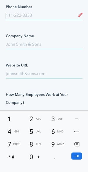
Input constraints maximize form efficiency by limiting inadvertent mistakes, delays, or confusion. For example, if someone was trying to make a reservation for a table at a restaurant and accidentally selected a date in the past, the constraint would prevent them from actually being able to select and confirm that date.
This is especially crucial when designing for mobile as smaller screens make it harder to enter information accurately. By setting input constraints, you’ll save people time while completing your form fields, and prevent yourself from receiving long-winded or invalid answers.
Here’s another example of an input constraint.
7. Create clear action buttons.
Buttons are an underrated aspect of mobile form design. Think about it: You get a form submission or conversion only after the right button is pressed. So you really can’t overlook this element.
This UI cheat sheet and UX Planet blog are great resources for designing effective buttons. Here’s a quick run-through of some of the mentioned principles that you can apply to your mobile forms.
- Too many buttons spoil the broth (just like form fields, keep only the essential buttons).
- Style and label your buttons consistently (capitalization, formatting, alignment, etc.).
- Let the focus shine on the primary button (the main action you want the user to take) by making it stand out by size or color.
- Right is right — a common rule of thumb for mobile is to position the main button on the right side and the second one on the left (though this can vary according to individual needs).
- Specific labels are almost always the answer (“Edit this page” over “Edit”).

8. Provide card scanners for payments.
Tried entering your credit card details in a form via your smartphone? Typing a bunch of numbers on a small screen with a small keyboard can be a tedious process.
Card scanning apps, such as Microblink, have become increasingly popular for that exact reason. When making a purchase, your visitors can click a button that takes them to a screen where they can use their mobile device’s camera to take a secure photo of the front and back of their card, whether that be their license or credit card.
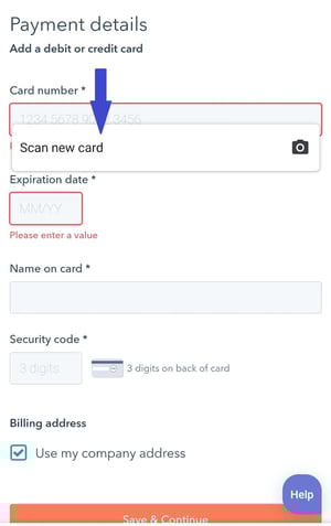
With just a couple of pictures, your leads will be finished with one of the most time-consuming parts of the mobile form completion process — keeping your visitors efficient as well as frustration and error-free.
9. Explain the need for specific information.
While completing a simple email signup or a registration form, have you ever been asked to provide personal information that has nothing to do with the signup form itself?
This is a common occurrence in all types of forms (not just mobile). Asking someone for personal or other sensitive information without explaining your need for it can seem sketchy.
When asking a question that doesn’t directly relate to the reason your visitor is filling out the form, it’s essential to create a summary box (with additional information) that the person can click on to understand why you’re asking for this information.
Such indicators can also help provide extra guidance on completing a form field when the instructions are not immediately apparent. In the image below, a summary box pops up when a person hovers over the icon.

These small details will make your form feel professional and thoughtful while reducing the odds of the user leaving halfway.
10. Gather validation and feedback.
User experience is at the heart of good mobile form design. And validation and feedback play an important role in providing a great UX.
Validation lets people know if the information they’ve entered is right (or not). Notice the green ticks in the form fields below.

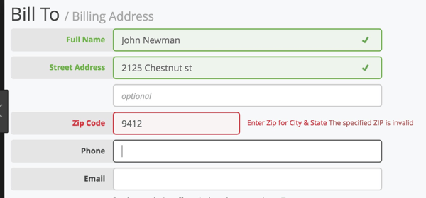
While completing mobile forms, your visitors are bound to make a mistake here or there. The form should flag these errors in real-time so the user can correct them immediately.
For example, if someone adds the incorrect zip code alongside their street address, the mobile form should display an error message. This should indicate — in easy-to-understand language — the error location and how the person can rectify it (as seen in the image below).
It’s also crucial to give people feedback as they go through the form. For example, a progress bar on lengthy, multi-step forms can make the form-filling process more engaging by showing users how far they’ve reached and how long they have left to complete it.

Consider a person filling out the above form without a progress bar. They’ll be clicking the ‘next’ button with no idea of when the form ends, and might even abandon it just before the final step in frustration.
Once people submit their forms, you should direct them to another screen or page that says something like, “Success!” or “Thank you” so they know their submission worked.
Here’s an example of a success page on HubSpot that appears after a user signs up to receive a free Google Ads kit.

11. Make forms accessible.
Accessibility is fundamental to the usability of your form. Forms designed with accessibility in mind can be used by a wider range of people, including those with visual, physical, sensory, and cognitive disabilities.
Here are some specific recommendations for creating accessible forms from the World Wide Web Consortium Web Accessibility Initiative, WebAIM, and The A11Y Project Checklist).
- Check that the text doesn’t pixelate or become fuzzy when zooming into your form (for better visualization).
- Label your form elements in a way that can be clearly understood when read by a screen reader.
- Ensure your form is accessible in both portrait and landscape modes.
- Avoid the use of a time limit (where possible) to give people sufficient time to respond.
- Include captions or transcripts for any video or audio components in your form.
- Keep color contrast in mind. Here’s a free tool that can help with that.
- Check that your form is fully-usable with just a keyboard.
A great way to ensure that all of the above mobile form design strategies stick is by exploring what you should not do in form design. The below video looks at some examples of what not to do when designing forms on both mobile and desktop.
Back To You
It’s no secret that your website visitors are completing and submitting your web forms via their mobile devices. That’s because it’s convenient and efficient, as most people carry some type of mobile device with them everywhere, making it crucial for your forms to be mobile-friendly.
Otherwise, your forms will be difficult to read, complete, and submit, which may frustrate your leads or cause you to lose their business altogether.
By considering your mobile form design and implementing these guidelines, you’ll enhance your mobile form user experience, build positive relationships with your leads and customers, and boost your conversions.
Editor’s Note: This post was originally published in Dec. 2018 and has been updated for comprehensiveness.
![]()


