16 of the Best Facebook Ad Examples That Actually Work (And Why)
On average, Facebook is home to over 3 billion daily active users — from CEOs to students to companies. And while the community is clearly there, connecting with them from a marketing standpoint isn’t always easy.
For brands, posting on Facebook alone isn’t enough anymore, especially for ones just starting out. Sure, you can invest in promotional content to drive users to your Facebook Page and website, but this requires more than an ad budget: it requires strategy.
One way to get the most out of your Facebook ad strategy is to create optimized Facebook Ads targeted at the right audience. By leveraging optimized ads, you can better allocate your PPC budget and better promote your brand.
We’ll show you how to make a great ad to achieve these goals through the best Facebook ad examples and practices we’ve seen yet.
- Do Facebook Ads Work?
- Best Facebook Ad Examples
- How do Facebook Ads work?
- Facebook Ad Placements
- Facebook Ad Formats
- Facebook Ads Best Practices
- Facebook Ad Resources
So, what does optimized Facebook advertising actually look like? To gain some inspiration for your next Facebook ad campaign, take a look at our list of the best Facebook ad examples from across industries.
Featured Resource: 50 Amazing Facebook Ad Examples
See these best practices in action with our collection of 50 Facebook Ad Examples from real businesses that we admire.
1. SofaLush
Video Ad

Why This Ad Works
- It’s visual: The video in the ad clearly demonstrates how the product works. Also, the video opens with a pressure cooker that seemingly “disappears” during the course of the video. This Easter egg prompted a lot of engagement in the comments, which further improved the ad’s performance.
- It’s relevant: It’s relevant to me because I was recently looking for new couches. This product shows an alternative to replacing my couch, on the off-chance that I might want to get more mileage out of my existing couch before making a new purchase.
- It’s valuable: The “how-to” style of the video is meant to underscore the value proposition: making your existing furniture more stylish… without a lot of hassle.
- It has a solid call to action: The ad states that there are over 150 designs to choose from and has a button that prompts me to “shop now” and see if one of them would fit my style.
2. Lume Deodorant
Photo Ad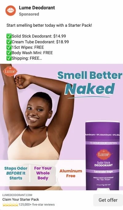
Why This Ad Works
- It’s visual: The vibrant, purple hues of the text, packaging, and background guide the user to the most important information on the ad like how Lume deodorant “Stops Odor BEFORE it starts.” The smiling model may showcase where you most commonly apply deodorant — your underarms — but the text makes a bold value statement that you can actually use it all over your body. This ad makes you feel better about a topic that doesn’t always feel so good — sweating — by making you feel confident in your antiperspirant protection.
- It’s relevant: I have been recently researching skincare products to begin a new regime. With this behavior cue, Lume knows that organic deodorant is better for skin but many brands fall short of being able to block odor, and some even cause rashes. This is also aluminum-free deodorant, an increasingly desirable option amongst consumers like their target audience.
- It’s valuable: Knowing where other organic deodorants fall short, Lume positions their brand without those drawbacks, and they do it in a clever and engaging way (the song).
- It has a clear call to action: The end of the photo ad prompts the user to click “Get Offer” so they claim their starter pack — a hassle-free proposition for consumers new to their products and unsure of where to start.
3. Kay Jewelers
Video Ad
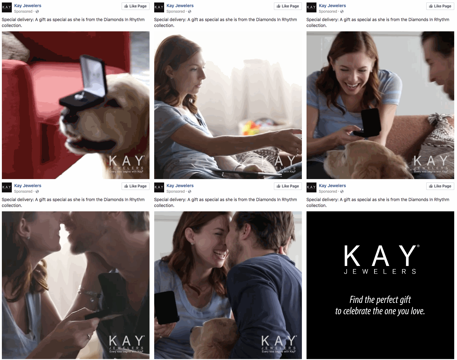
This Facebook video ad from Kay Jewelers tells a quick but moving story — something Kay Jewelers is well-known for — using just a few seconds of your time. You don‘t even need the sound on in the video above to know what’s happening and the message Kay is sending.
If you‘re advertising a product with sentimental value, like Kay Jewelers, video ads are the way to go. Just be sure your video has a clear (and happy) ending — people view videos more passively on Facebook than they would on YouTube and don’t have time to interpret your ad if it’s too long or complex.
Why This Ad Works
- It’s visual: Even though this is a video, I have a general idea of what I will be watching, thanks to the screen capture it started with. Additionally, I can understand the gist of this ad without playing with the sound on, which is important given that most users are more likely to view videos with the sound off.
- It’s relevant: It’s relevant to me because I was recently scouring jewelry websites, specifically for necklaces like the one in the ad.
- It’s valuable: Kay shows potential customers the value of purchasing with the help of the happy reaction from the woman receiving the gift in the ad. Plus, who doesn’t love dogs?
- It has a solid call to action: This ad is set up to drive Page Likes, which is an easy, one-click way for me to get more relevant content served up to me.
4. Monday.com
Photo Ad
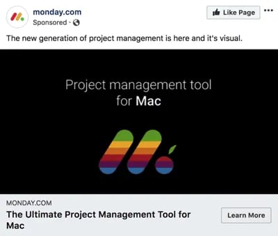
Monday.com is a task-management tool that caters to multiple operating systems, both desktop, and mobile. But in the photo ad above, the company used its compatibility with Mac computers to remix its own logo in the original rainbow colors of the Apple brand.
For growing businesses like Monday.com, it‘s a smart idea to pivot off the brand awareness of household names. By filling the Monday logo with Apple’s famous rainbow color-way, the ad above captures the attention of Mac users who’d recognize those vintage rainbow stripes anywhere (and could use a new task-management tool that works on their computer).
Why This Ad Works
- It’s visual: The rainbow colors filling the Monday logo are both eye-catching against the black background and familiar to any Mac user.
- It’s relevant: For Mac users, and those who need to organize their tasks on a regular basis, this ad is relevant to their lifestyle in more ways than one.
- It’s valuable: The ad calls attention to Monday‘s compatibility with Mac computers, making the product’s user experience more valuable to Mac users as a result.
- It has a clear call to action: The “Learn More” CTA on the bottom-right of the ad is a clear invitation to find out more about this product’s usage on Apple hardware.
5. Amazon
Event Ad
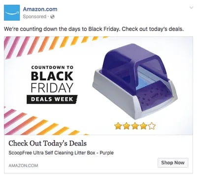
This is how an event ad from Amazon looks in the News Feed on a desktop. This ad works well on a few different levels: A sample product is clearly displayed, the ad shows an impressive (but honest) rating of that product, and you know which event Amazon is promoting right away — Black Friday.
Ecommerce companies like Amazon use event ads to boost sales at specific points during the year, and Facebook event ads make this easy. When investing in event advertising, build a list of the holidays, shows, conferences, and awareness months your business cares about. That way, you know exactly which market campaigns line up with these occurrences and when to promote them on your Facebook Business Page.
Why This Ad Works
- It’s visual: Not only is this image larger than the right column ad display, but it also uses warm colors, white space, and directional lines, which drew my eye toward the featured product.
- It’s relevant: As a cat mom, this offer is clearly tailored to my consumer needs.
- It includes an enticing value prop: Amazon has advertised a self-cleaning litter box here, which is of tremendous value for any cat owner. Additionally, it shared the strong customer ratings below an image of the product. (Social proof, anyone?)
- It has a clear call to action: Amazon instructs me to click on its ad today, after which point the deal for the litter box will presumably disappear. “Now” is strong CTA language that compels clicks.
6. NatureBox
Photo Ad
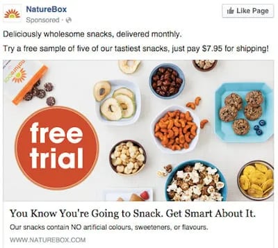
This photo ad by NatureBox features a creative point-of-view shot that is perfect for the angle at which you‘d dive into the company’s various healthy snacks. The ad makes you imagine your next house party… I thought the peanuts spilling out onto the table was a nice touch.
In your next Facebook photo ad, play around with live-action photography and digital design in the same image. As you can see in the ad above, NatureBox was able to design a vibrant “free trial” icon right on top of an image that would’ve worked just as well on its own.
Why This Ad Works
- It’s visual: The image shows you exactly what you’re getting, and it calls out the “free trial” CTA well.
- It’s relevant: Everyone likes to snack. In all seriousness, the person who saw this is a fan of several lifestyle subscription companies, which is what NatureBox is.
- It’s valuable: This ad is full of value. First, the “free trial” callout is the first thing your eyes go to when looking at the image. Second, it clearly mentions the healthy aspects of the goodies in its product.
- It has a clear call to action: NatureBox is asking you to try its free sample. It couldn’t be easier to know your next step.
7. Winc
Retargeting Ad
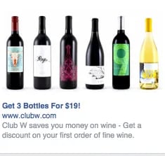
Here’s an example of a short and sweet (literally) retargeting ad from Winc (formerly known as Club W). This ad is displayed on the right column of Facebook specifically for users who browse wine-related content online. When your ad caters to people who you know would be interested, modeling the product the way Winc does above can be a home run for your brand.
Why This Ad Works
- It’s visual: The visual is clear, simple, and appealing to all types of wine lovers wine-lovers.
- It’s relevant: This came up in my wine-obsessed colleague’s News Feed. Need I say more? Two thumbs up on relevance.
- It includes an enticing value prop: Three bottles for $19? What a steal. They also pull the viewer in with an additional value: a discount on their first order of wine.
- It has a strong call to action: The word “get” is strong call-to-action language, and it’s used twice here. A time limit on this offer would have made it even stronger.
8. Shutterfly
Multi-Product Ad
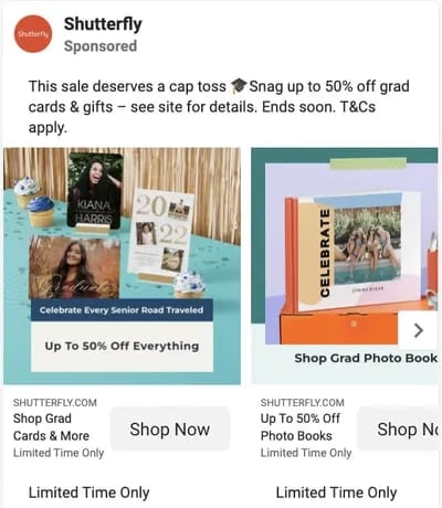
Here’s an example of a multi-product ad from Shutterfly, along with the additional images that are used in the ad. Each image has a different offer, to appeal to many different demographics in one ad.
In each image, the product being promoted is consistent in the look and feel of the Shutterfly brand — this is an important quality of ads that showcase more than one item and picture.
Why This Ad Works
- It’s visual: This series of images leans on a consistent color palette, making it feel both cohesive and on-brand. (Including delicious-looking cupcakes doesn’t hurt either.)
- It’s relevant: The person who saw this loves taking photos of life events like graduations and creating sentimental gifts from these moments. Spot on, right?
- It’s valuable: There is a clear value for the user, 50% off each of the products being advertised. The sale details aren’t stated and it only alludes to a fastly approaching end date but this also encourages users to click through to the website in order to find this information. This ad also has an added level of value, it is showing the many different ways people can create grad cards and gifts using Shutterfly, in ways many may not be aware of.
- It has a clear call to action: I know I need to use this before February 17th when this deal expires, so I would be encouraged to take action right away.
9. MU Campus Dining
Reach Ad
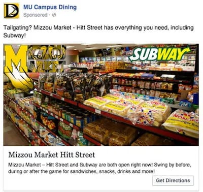
This Facebook Reach ad from Mizzou Campus Dining promotes amenities at the University of Missouri, using two familiar logos and a marketplace that anyone on campus might recognize.
The ad copy beneath the image invites customers in “after the game” — a reference to campus life that helps Facebook users imagine when they might want to stop in for a sandwich.
Why This Ad Works
- It’s visual: This image has college pride, a variety of salty and sweet treats, and a well-known logo to attract hungry college students.
- It’s relevant: This ad is likely only being shown to students on campus who are in its target audience. It also mentions the sports game that was going on at the time and plays to the student’s current needs: snacks and Subway sandwiches.
- It’s valuable: Mizzou Market is telling hungry college students that it has everything students need for the big game.
- It has a clear call to action: This ad has the option to show directions, making it extremely easy for a college student on the go to follow the walking directions to this market.
10. Boston Sports Clubs
Offer Ad
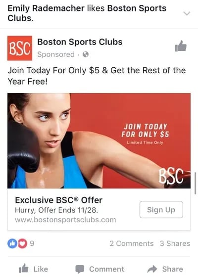
All consumers really need to see is the boxer pictured above to know what this ad by Boston Sports Clubs (BSC) is offering. The woman in the photo even looks like she’s staring at the text to her left, getting viewers to shift their attention to the promotion right away.
This Facebook Offers Ad makes it obvious what customers would be signing up for when they click the “Sign Up” CTA button below the picture. Offer ads can easily mislead viewers into pressing their CTA just to get them to click on it, but it ultimately doesn‘t convert viewers into customers. BSC’s approach above is clear and upfront about what it’s offering throughout its conversion path.
Why This Ad Works
- It’s visual: The featured photo uses bold colors and clear typography to draw my attention to the details of the offer, and the woman exercising gives me an idea of what I could gain from purchasing the offer.
- It’s relevant: I recently moved to Boston and have been searching for gyms in my area online, so this ad is highly relevant to my recent Facebook and search activity.
- It’s valuable: Paying $5 for a monthly gym membership is a great deal. Even though the price may increase in the future, the low price definitely makes me want to click.
- It has a clear call to action: The CTA emphasizes that the discount offer is limited and should be claimed quickly using the word “hurry” and telling me when the offer expires.
11. Allbirds
Video Ad
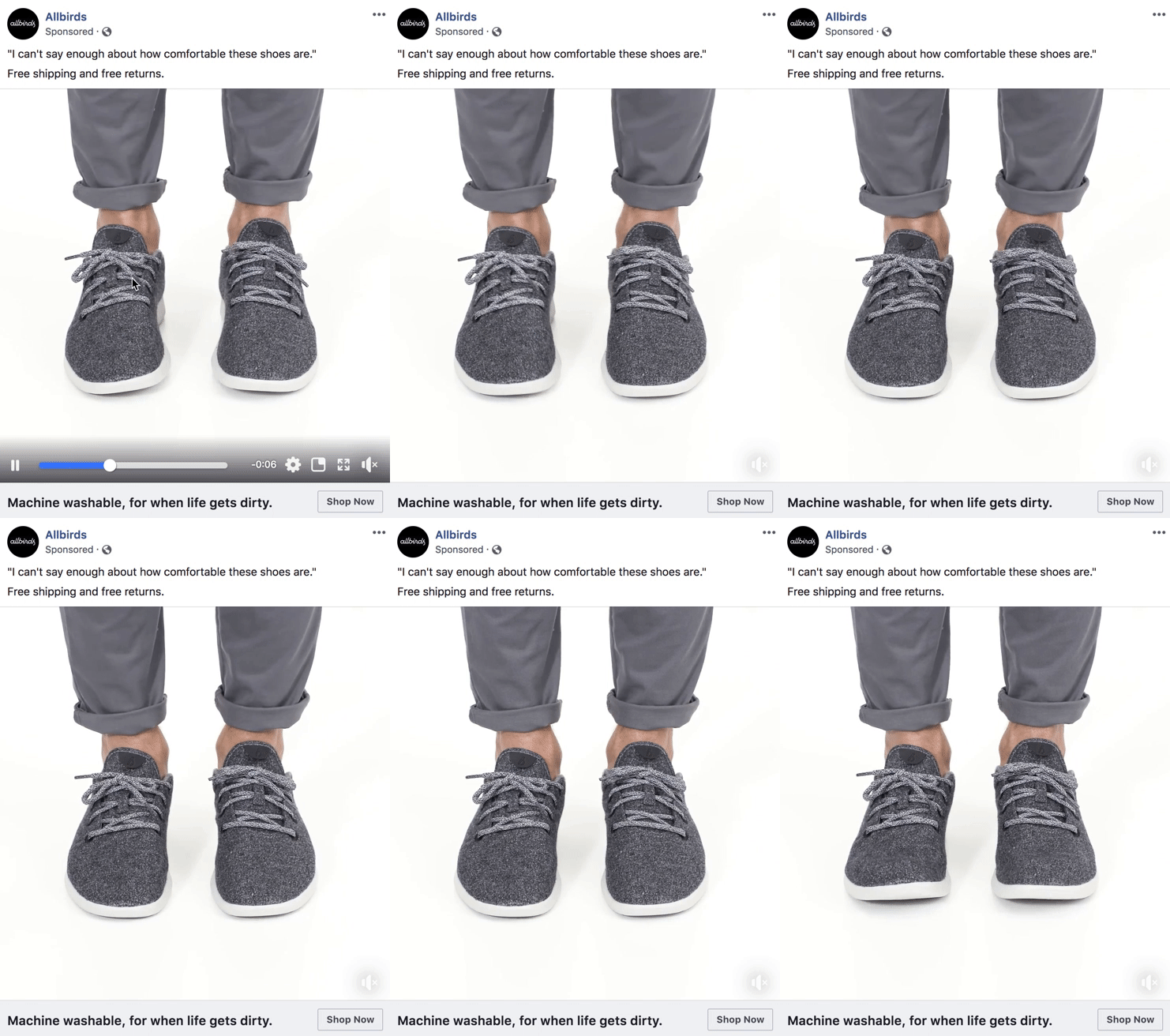
This video ad by Allbirds, a shoe maker, uses simplicity and whitespace to its advantage. The video only lasts nine seconds, but Allbirds demonstrates the product in a way that catches your attention and resonates with the individual wearer.
There’s a lot of ad content on Facebook, and when Facebook users scroll through their News Feeds, that content starts to blend together. Sometimes your best chance at sticking out on Facebook is by using subtle movements and details — like Allbirds did, above. Let every other video on Facebook be quick and flashy, and yours will be a breath of fresh air to your audience.
Why This Ad Works
- It’s visual: The video has a clear focus on a subject, and that subject is engaging in a movement that means something: These shoes are comfy. I subconsciously started wiggling my own toes as I saw this ad for the first time.
- It’s relevant: I’m always interested in finding new shoes — I probably search or click on something related to footwear once a week. This ad feeds that interest in a unique way.
- It’s valuable: The opening quote above the video is reason enough for me to want to learn more about why these shoes are so comfortable. Allbirds also sweetens the deal with “free shipping,” “free returns,” and a note below the video that the product is “machine washable” — all without taking the focus away from the video itself.
- It has a clear call to action: If I want these shoes, there’s a “Shop Now” CTA button to the bottom-right of the ad, waiting for me to take a closer look at them.
12. The New York Times
Photo Ad
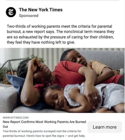
This photo ad by The New York Times is driving traffic to a written article with an intriguing illustration. The drawing literally depicts the article’s ideal audiences — working men and women raising children. For parents who are even a little interested in understanding burnout and mental health, this image (along with the statistically backed report in the headline) clearly shows a tired mom trying to catch some rest with her children.
When publishers advertise on Facebook, they need to connect with their audience through featured images that evoke emotion — if their main product is a reading experience; the photo they choose has to complement their written content perfectly. The New York Times’ ad above is an example of photo ads done right.
Why This Ad Works
- It’s visual: This ad is emotionally impactful — if you have not been a tired, working parent then it is you’ve seen them, and that sight can make you feel immense compassion towards them. By including a visual that makes a user care enough about the ad to read it and click through, NYT is accomplishing the goal to which every ad aspires.
- It’s relevant: Especially, in the wake of COVID with parents simultaneously balancing work and personal life within the same space, the topic is incredibly relatable. This is an article I would personally be interested in reading, and it helps that the ad appears like a native post promoting an article in my News Feed.
- It includes an enticing value prop: The ad states that you can find help if you recognize the signs of parental burnout, which can feel like being tossed a life jacket — especially to the parents reading the report. This social proof makes you more likely to click and read the article.
- It has a clear call to action: This ad is dedicated to helping parents make sense of the signs and get help for their fatigue, so by encouraging parents to ”Learn More”, the call to action makes you want to click the article to finally find answers.
13. Tortuga Music Festival
Event Ad
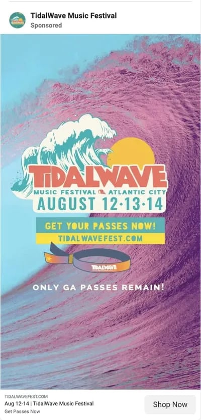
Successful event ads have at least two important qualities: the event‘s schedule and something to justify why people should attend. The event ad above for the Tortuga Music Festival accomplishes both of those things — it displays the date and time and the bands playing and shows you a picture of the amazing time you’ll have if you come.
Why This Ad Works
- It’s visual. The picture alone is worth a thousand words about how much fun this concert would be. Not only is it on the beach, it was also taken on a gorgeous day and the stage looks amazing. Also, it clearly represents what to expect during the event, and it catches the eye as someone scrolls through their News Feed. (The beautiful ocean water definitely helps.)
- It’s relevant. The person who saw this ad is a fan of Kenny Chesney and has been to his concerts before. They’re also originally from Florida, which is where this event takes place.
- It’s valuable. Since the image was taken on a beautiful day, it looks like an ideal place to be — especially to those of us viewing it from our office desks. It also clearly tells you the cost of the ticket so you know before you click. (This is also good for the advertiser: By including the price, the ad allows users to self-select based on whether they can afford the ticket. If they can‘t afford it, they won’t click through, thus saving the advertiser money on unqualified clicks.)
- It has a clear call to action. The CTA is clear: “Buy.” The advertisers also add urgent wording with the title “Time is running out!”, encouraging you to purchase your ticket now before it’s too late.
14. Adrianna Papell
Retargeting Ad
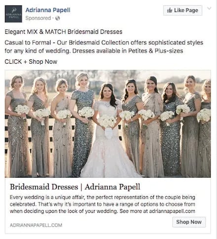
Last week, I started shopping around for a bridesmaid dress for an upcoming wedding I’ll be in. Today, the ad above appeared in my News Feed.
Retargeting ads enable you to get in front of those viewers who are already looking for what you‘re offering. This retargeting ad by Adrianna Papell doesn’t just show me what I‘m on the market for — it excites me about how beautiful our own wedding party pictures will look on my friend’s big day.
Why This Ad Works
- It’s visual. The image gives me a good idea of what to expect from the designer’s website, and it definitely helps that the gowns are both unique and stunning. Talk about a showstopper.
- It’s relevant. The ad called out that I was already shopping for bridesmaid dresses, and what’s more, I had previously looked at dresses on this exact website, so this ad is highly relevant to my search.
- It’s valuable. The variety of dresses in the ad’s image and in the description make this website worth a visit for someone trying to find the perfect gown out of thousands of options.
- It has a clear call to action. The CTA is “Shop Now,” which encourages me to click to purchase the beautiful dresses in the ad’s image.
15. Bustle
Boosted Post
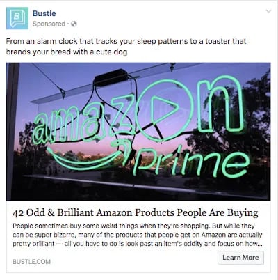
Here‘s an example of a boosted post from Bustle, which promoted one of its articles on Facebook. Paying to “boost” a post you already posted organically to your Facebook Business Page can greatly benefit content that has mass appeal — versus a post that targets a specific segment of your audience. Bustle’s choice of a boosted post here falls into that first category.
From Amazon‘s vibrant neon sign in the photo to the high number of examples included in the article (42, to be exact), Bustle’s boosted ad is sure to pique the interest of many Amazon and Bustle followers.
Why This Ad Works
- It’s visual: Lots of people are familiar with the Amazon Prime logo, but not in neon lights in a window display. It made me do a double-take while scrolling through Facebook.
- It’s relevant: As we’ve already learned from the earlier examples, I like shopping on Amazon and also read Bustle, so this article is a combination of those two behaviors.
- It’s valuable: “Brilliant” is a strong adjective to describe products, which makes me curious to learn more about purchasing them.
- It has a clear call to action: The ad entices me with information about useful and “brilliant” gadgets I can get delivered to my door within two days, which I’m happy to click to learn more about.
16. La Colombe Coffee Roasters
Offer Ad
This ad from La Colombe Coffee Roasters is promoting its canned Oatmilk Salted Caramel Latte with a 20% off discount. It emphasizes that the drink has all the same flavor and creaminess of a regular latte — without the dairy.
Offer ads can be a highly effective way for businesses to attract new customers, drive conversions, and generate buzz around special deals. By leveraging Facebook’s ad targeting capabilities, La Colombe is able to present their discounted offer to customers directly on their feeds.
Why This Ad Works
- It’s visual: The vibrant colors in the photo instantly caught my eye as I was scrolling through my Facebook feed. Plus, the offer is highlighted in bright red, making it stand out in the image.
- It’s relevant: I’m an avid coffee drinker and I had been searching for canned coffee brands earlier in the day.
- It’s valuable: The ad offers a 20% off discount code on the first purchase, which gives me more incentive to try out the product.
It has a clear call to action: The CTA “Shop Now” invites me to find a new canned coffee that I can use the discount on.
Facebook ads can be a great way to reach out to potential customers, but it’s important to make sure yours stands out from the rest. Creating a great ad is all about understanding your audience and what they want to see, these insights will show you how to leverage Facebook ads so that they work for you.
To invest in Facebook Ads effectively, you first need to know who your ads are directed toward. When creating a new ad on Facebook, you can create a new audience that includes many customizable characteristics. Among them are:
- Location.
- Age.
- Sex.
- Languages spoken.
- Interests and behaviors.
- Their connections to your other business-related pages on Facebook.
You can also create what’s called a Lookalike Audience, which permits Facebook to create an audience for you that best resembles a particular “source.” This source can include some or all the information listed above.
Facebook Ad Formats
After you define the audience you want your ads to reach, it’s time to choose the Facebook Ad format you think they’ll find most engaging from these eight options:
Format 1: Photo Ad
Photo Ads are still images that can help to promote a product or event you want to specifically call attention to. If you have a special promotion going on, for example, this ad format puts a crisp snapshot of your product or venue at the center of your ad.
For ads shown in a Facebook News Feed, the recommended image resolution is at least 1080 x 1080.
Format 2: Video Ad
Video Ads have a GIF or video as the centerpiece of the advertisement and can be used to demonstrate a product or event. Video Ads help you form deeper connections with your audience by aligning your brand with a type of content online users are quickly consuming more of (nearly 80% of all data consumed on mobile devices will be in video form by 2021, according to a Facebook study).
There are six types of video ads you can invest in on Facebook:
- Short Videos and GIFs
- Vertical Videos
- Instagram Stories
- Video Carousels
- Video Collections
- In-stream Videos
Format 3: Stories Ad
Stories Ads are a part of Facebook Stories, one of the newest content types rolled out by Facebook that allows users to post temporary clips and images of their day for their friends to see. This type of ad is fitted to the dimensions of a mobile device and can be played on both mobile and desktop.
As users browse their friends‘ Stories, these ads can appear in the same format inside a stream of Stories. For this reason, it’s best to create Stories Ads that reflect the same candid and entertaining look and feel that people see from their friends. Stories Ads can be placed on Facebook, Messenger, and Instagram.
Format 4: Messenger Ad
A Messenger Ad appears as a direct message in a user‘s message list when they’re inside Facebook’s Messenger app. These ads allow you to interact with your audience, showing them offers you think they would like, and listening to their responses to better tailor your next message to their interests.
Let‘s say your ad’s first message is “What product might you be interested in?” The user can then select from three different responses, triggering your ad to produce a more specific product offer directly in the message thread.
Format 5: Carousel Ad
Carousel Ads contain a series of images or videos that users can rotate through, all of them helping to describe a single product, service, or event the ad is promoting. Each Carousel Ad can contain up to 10 images or videos at a time and link to their own individual web pages. Because these ads carry so much media, according to Facebook, they’re ideal for:
- Endorsing multiple products.
- Promoting multiple features of the same product.
- Telling a story or sequence of events that unfold over the course of multiple pictures or videos.
- Explaining a process to potential customers.
Format 6: Slideshow Ad
Similar to Carousel Ads, explained above, Slideshow Ads segment your ad into individual images that users view one after another. The difference between these two ad formats is that Slideshow Ads only play images (not videos), and the ad compiles these images into a slideshow that plays automatically in the form of a video. According to Facebook, Carousel Ads are ideal for:
- Creating a video-like experience for users quickly and with a small budget.
- Advertisers who want to choose from a library of pre-created images and music (a unique perk of Facebook’s Slideshow Ad).
- Simplifying an otherwise complicated concept or process for potential customers.
- Reaching people who have slower internet connections (Slideshow Ads use five times less data than video ads on Facebook).
Format 7: Collection Ad
A Collection Ad allows advertisers to bring the buying process directly into Facebook, so potential customers can move from “discovery” to “purchase” more easily when they see a product they like. This ad format features a central image or video promoting a product, with a collection of four smaller images below it that viewers can click on to learn more about the product. There are four types of Collection Ads you can invest in:
- Instant Storefront: This ad is ideal for displaying multiple products as part of the same ad campaign, and driving traffic to each product’s respective product page.
- Instant Lookbook: This ad is ideal for demonstrating or modeling a product in various contexts for your audience.
- Instant Customer Acquisition: This ad is ideal for driving traffic to, and prompting them to take a specific action on, a product’s landing page.
- Instant Storytelling: This ad is ideal for telling a story about your brand or helping your audience learn more about the business.
Format 8: Playables
Playables cater specifically to app developers. This ad format allows your audience to watch, preview, and even play an abbreviated version of your new app directly from inside the ad.
So let’s take a look at the different ad placements that you can use to best position your brand promotion.
Facebook Ad Placements
After customizing your ad’s audience, you need to consider how the ad will look on both desktop and mobile. This ensures you design your ad for easy viewing no matter where it appears on Facebook. Here are three different places you can see your Facebook Ads show up:
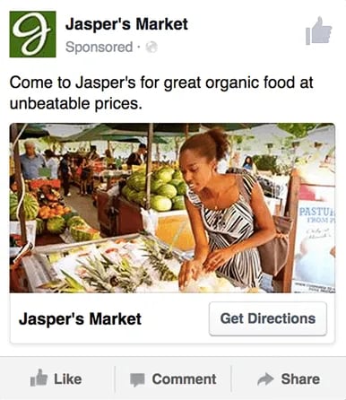
Placement 1: Right Column
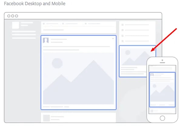
This type of ad is the most traditional on Facebook, it appears on the right side of a user’s Facebook News Feed. This is the first type of advertising Facebook had, and it still exists today.
Although ads in the News Feed are likely to get higher engagement metrics due to its native advertising features, right column ads shouldn’t be forgotten. We often see less expensive clicks and conversions when using these ads. In order for a right column ad to be successful, it needs to be relevant, have a value proposition, a good visual, and have a call to action.
Placement 2: Desktop News Feed
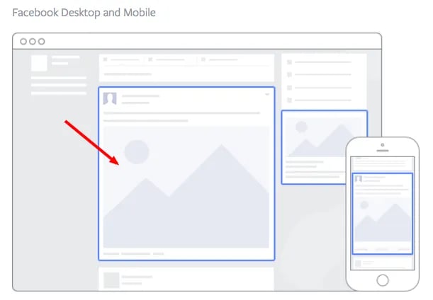
This type of ad appears directly in a user’s News Feed when they access Facebook on a desktop computer, and it looks more like native advertising. In our experience, these ads have a higher engagement rate than right column ads, but they can also be more expensive. These ads must follow organic Facebook posts’ best practices and be both engaging and visual.
Placement 3: Mobile News Feed
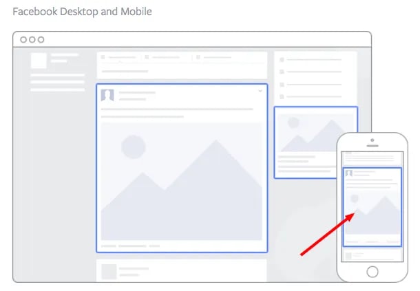
Like the desktop News Feed ad, this type of ad appears in the user’s mobile News Feed and displays like an organic post from the people and Pages they follow.
Pro tip: When picking your ad placements, think about the best position to showcase the Facebook ad format you choose, as well as, the ad template you use to add color to your marketing vision.
Facebook Ad Templates
Facebook Ads can be used to accomplish a number of different goals for your business. Here are a few real ads that you can use as templates of inspiration when creating an ad that targets the same goal:
Video Product Demo Facebook Ad Template
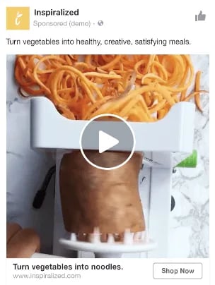
Video ads appear fairly large in the user’s News Feed and offer more engaging content than static posts. And with 100 million hours of video being watched on Facebook every day, it serves as an interesting — and potentially profitable — ad type for marketers to try out.
How can you create your own video ad? First, understand Facebook video ad requirements including length and video size. We suggest keeping your video as short as possible, even though Facebook allows you to upload a much larger video. Create a video that displays your product or service, and upload it directly to the Facebook ads manager by following these instructions.
Photo Model Ad Template
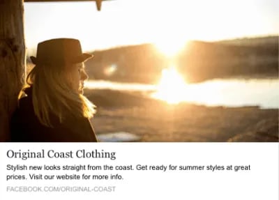
Another type of rich media advertising on Facebook is a post of an image. This is one of the most popular types of ads ever since Facebook began favoring visual content. The optimal size for News Feed photo ads is at least 1080 x 1080 pixels, otherwise, your image will get cropped. Adjust your image based on the target audience’s needs and by what will appeal to them the most.
Multi-product Ad Template
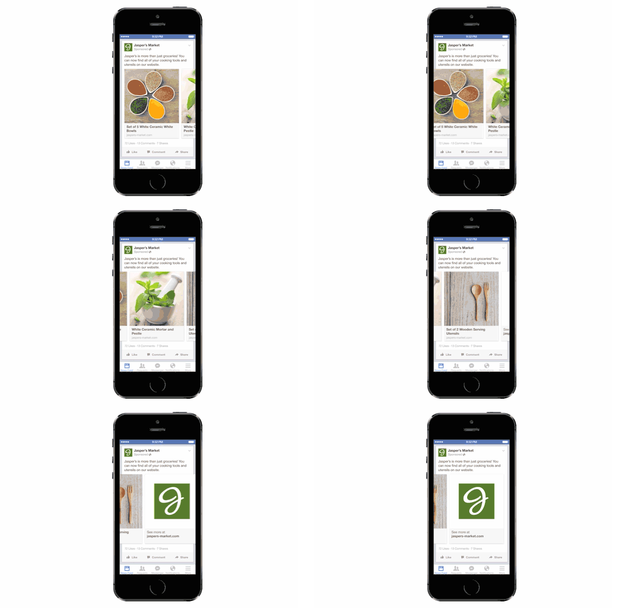
Multi-product ads allow advertisers to showcase multiple products within one ad. Viewers can scroll through the images and click on individual links to each product. You can promote multiple of anything, not just products — like different blog posts, ebooks, or webinars. These ads can be created in Facebook Ads Manager.
Reach Ad Template
Reach ads on Facebook are designed to grow your local awareness. They only work if your business has a physical location to which you’re trying to drive real foot traffic. If you fall into this category, locally targeted Facebook ads might be a great fit for you, as you can hyper-target on Facebook down to the mile.
If your business has an offer or event going on at your store, set up a few Facebook Reach ads that appear only to people within a short distance of your store. Have these ads appear a few days prior to the event and on mobile devices while the event is happening. You may want to reach some people the day of the event who happen to be in the area and check their Facebook accounts on their smartphones.
Special Offer Ad Template
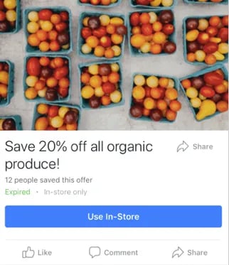
An offer ad is a form of Facebook advertising wherein a business can promote a discount on a product or service that can be redeemed on Facebook. The benefit of this? It eliminates one step in the buyer’s journey, which ultimately increases sales.
The offer ad has many benefits. First, it drives the user directly to the offer. The user claims it directly on Facebook, removing any added friction of needing to go to your website for the offer. You also can reach any type of audience that you want, as all the Facebook targeting options are possible.
Finally, you can include all the information needed for the user to decide if they want it or not, including the time period it is usable, the number of people who have already claimed it, and the exact amount the offer is. This will eliminate any unqualified clicks, which cost you money.
Event Ad Template
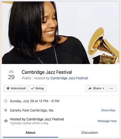
Event ads promote a specific event. The CTA on these ads usually sends users directly to the ticket purchase page, wherever that happens to be hosted.
Using this type of ad will help drive a targeted group of people to attend your event. These will show up in the News Feed of the specific audience you’ve chosen. Events are a big part of most businesses, but getting people to attend even a small event can be tricky. Promoting your event to a targeted specific audience on Facebook can help drive the right kind of attendees.
A good ad in this format will clearly show the benefit of attending the event: the price, dates, and a clear CTA to purchase a ticket.
Boosted Ad Template
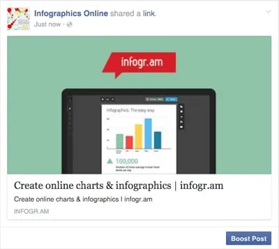
A boosted post is an organic Facebook post that was originally on the homepage of a company’s Facebook, and that later was boosted with advertising money.
This is different from the above ads because it’s not created in the Facebook Ads Manager. You can include more in the description, as there is no limit to word count on boosted posts like there is in ads. You can also have a link in the copy.
The cons? Boosted posts leave you fewer options for bidding, targeting, and pricing. You also cannot run any types of A/B tests because you‘re promoting a post that has already been created; you’re not creating one from scratch.
Retargeting Ad Template
A retargeting ad promotes an ad to a specific list of previously identified people. Have you ever seen ads follow you across the internet after visiting a certain website? Then you’ve seen a retargeting ad.
Facebook has the same capability. An advertiser can advertise to a list of leads or customers by uploading a list of email addresses it already has into Ads Manager to make a custom audience. A good retargeting ad acknowledges that the brand knows you‘re already interested in its product. (Because let’s face it… retargeting can be a little creepy.)
Now that we‘ve covered the best ad examples, main formats, placement possibilities, and standard templates, let’s dig into ad best practices that help optimize your Facebook campaign.
The key to making great Facebook ads is about understanding your audience and what they want to see. By creating a promotion that is relevant and attention-grabbing to your target audience, you’re more likely to see a return on your investment.
Despite all of the advantages that Facebook offers advertisers, seeing success with Facebook ads ultimately comes down to your strategy and how well you implement it.
1. Target your ads to a specific audience.
Audience quality is more important than size because, with Facebook advertising, the goal is engagement and/or conversions. Casting a wide net to individuals who are not your target audience will tank your relevance scores and give you bad data to work from.
The good news is that Facebook’s targeting capabilities are more robust than any other platform, including demographics, interests, location, and even behavior. That means you can get far more specific on who you want to see your ads.
For example, you don’t have to settle for “women between ages 25 and 45” when you can target “women between ages 25 and 45 who like reading and whose favorite author is Suzanne Collins.”
By getting granular, you end up excluding users who are not your target market, showing ads to only those who will find it most relevant and who are most likely to convert.
2. Make your ads relevant to your audience.
Relevance is critical for success when using Facebook advertising. Remember, you are spending money when someone views or clicks on your ad (depending on the settings you use). If you‘re showing ads that aren’t relevant to your target audience, you’re wasting your time and money and will likely not see success with any advertising.
Facebook determines ad relevance through its ad relevance diagnostics (formerly ad relevance score). Several factors are evaluated to determine the relevance of your ad, including feedback from users (such as ad hides or negative feedback), engagement (such as clicks, likes, or shares), and predicted positive actions (such as conversions or video views).
Additionally, Facebook provides diagnostics for three specific dimensions: quality ranking, engagement rate ranking, and conversion rate ranking. Ultimately, the more relevant your ad is, the more favorably Facebook will treat them.
3. Include a visual element.
Visual content is not only treated more favorably in the Facebook algorithm, but it’s also more likely to be shared and remembered than written content. The lesson for Facebook marketers? No matter what type of ad you create, your image needs to be visually appealing.
Check out this blog post for a detailed guide to image sizes for various ad units on Facebook along with some tips on posting visual content.
4. Align your ads’ visuals and copy.
Let‘s say you’re running an ad for astrological jewelry. You’re targeting people who like astrology and whose birthday is coming up.
You could use a generic “buy a bracelet with your astrology sign” copy paired with an image/video of all the jewelry.
A better strategy, however, would be to target those whose birthdays are coming up and create a more specific ad targeting that astrological sign (e.g. “All you Geminis out there will love this” paired with a video of a specific Gemini product).
Aligning copy and visuals in a way that‘s relevant to the targeted audience provides a feeling of personalization which increases the likelihood of engagement and/or conversion. You’ll also see better ad performance due to higher relevance scores.
5. Include an enticing value proposition.
A value proposition tells the reader why they should click on your ad to learn more about your product. How is your product or service different from any other? Why should the viewer click on your ad to see your website?
Your value proposition should be believable. For example, saying you have the greatest sandwiches in the world will not make people come to your business’s Page, but maybe offering 20% off will. Or, perhaps adding social proof will help — something like, “Sandwiches loved by over one million people every year! Come try yours today and get 20% off your order with this coupon.”
6. Have a clear call to action.
A beautiful and relevant ad is great, but without a CTA, your viewer might not know what to do next. Add a CTA like “Buy now and save X%,” or “Offer ends soon” and add a sense of urgency to your viewer. Your CTA should encourage people to click on your ad now.
7. Test different ad formats.
Experimenting with various ad formats in your Facebook ads allows you to optimize your campaigns by identifying the most effective formats for your audience, objectives, and budget. It can also help you increase engagement, improve creative effectiveness, and maximize the impact of your advertising efforts.
You can test different ad formats by creating multiple ad sets within your Ads Manager account. Just make sure to keep other variables, such as targeting, audience, or placement, consistent across the ad sets you’re testing.
8. Continually monitor ad performance.
Review the performance of your ads regularly and optimize them based on key metrics such as click-through rates (CTR), conversion rates, engagement, or return on ad spend (ROAS). This enables you to gain valuable audience insights, prevent ad fatigue, make real-time adjustments, and drive long-term campaign success.
Use Facebook’s Ads Manager or other analytics tools to monitor the performance of your ads. Review metrics and assess how each ad is performing relative to your objectives.
Pay attention to trends, patterns, and deviations from expected results. Keep an eye for underperforming ads so you can prioritize them for optimization.
Based on what you find in your analysis, take specific actions to improve the performance of your ads. This could involve making adjustments to ad creative, testing different headlines, refining targeting parameters, or modifying your bidding strategy. Experiment with different optimization strategies to see what works best.
Facebook Ad Resources
- Facebook Marketing: The Ultimate Guide
- Facebook Business Manager: How to Use Meta Business Suite
- How to Run Facebook Ads: Step-by-Step Guide to Advertising on Facebook
- 15 of the Best Facebook Ad Examples That Actually Work (And Why)
- How to Create An Effective Facebook Ad Strategy
- The Facebook Ad Types: How to Choose the Best Ad Type for Your Goals
- A/B Testing on Facebook: How to Do It Right
- 22 Facebook Stats to Know in 2023
Engage Your Target Audience with Ads That Make an Impact
The first step to reaching potential customers or retargeting your customers to bolster brand loyalty is by visually and expertly promoting your products and services where they can see them: on their Facebook News Feed. So draw inspiration from our list of the best Facebook ads we’ve seen to keep your promotions relevant to your target and visually impactful as you test different ad formats.
Editor’s note: This post was originally published in May 2020 and has been updated for comprehensiveness in June 2022.
![]()

